Understanding our Users for our core product: The Form editor dissected
When you want to quickly gather data. One of the fastest ways to do this for your company is with a digital form that is specifically set to your needs. A form editor that you can use for every scenario that you encounter. The tool is global to use for many scenario’s. This is the biggest challenge we face with the Form Editor, understanding our varied target audience and understanding their needs for a digital form editor with logic and integrations baked into the experience. This could only mean one thing: scope creep.
Product Designer, at
MoreApp
Responsibilities
- UX Research
- Stakeholder Management
Platforms
- Currently not launched
Duration
- 3 months
Discover
Diverging into our problem space. We don’t know what our users except, and what could be their issues to begin with.
Preliminary research
To understand what the product is, we held internal interviews. Asking the senior developers, customer success and our product owner what they all knew about our product. And more important, what they thought the biggest pain points were regarding our users. Some insights gained from this process were small pain points (users want to see the preview of the form at all times) and big pain points (users are just going to ask for a completely new folder structure).
We’ve used these insights as a jumping off point for our further research.
User Research
Together with my UX-colleague, we opted for a research phase before even ideation started to explore different solutions. As we wanted to double down on the problem our current users experienced with our current product.
We’ve made a shortlist of our biggest (Dutch) clients and some smaller clients, got in contact and set up in person meetings to understand the context of our users. Together with the shortlist of the clients, we’ve set up some basic open-ended questions to understand their difficulties.
Some basic questions:
- What are you using our product for? What is your experience with this? What kind of difficulties are you encountering, and how do you try to find a workaround for those difficulties?

We’ve ended up with 12 interviews. All real customers, more than happily share their thought on our product.
Define
Converging the concerns and pain points of our users into insight statement cards. Keeping stakeholders in check and managing expectations, internally in MoreApp and externally with our users.
Synthesizing results
From these interviews, the most common frustration, pain points and needs were:


What we derived from this information was that the product in the current state was actually “good enough” for most. Even one user went so far in their interview they didn’t know how we could improve the product we’re researching. “It’s perfectly fine as it is”. Which felt odd, as the same user later complained about one or more features.
The biggest need our users had was that they don’t want to spend too much time in our product. They’ve found the experience of making a form fine. They liked the feeling of seeing a form with their own logo on top, very neat. Furthermore, they also were very busy people, thus speed and time is of upmost importance.
To round off our research, we wrote a How Might We statement to bundle everything from our research to move forward.

Sharing these insights
Up until this point, this was all a two-man show. We didn’t share any insights up until this point. We shared some through company-wide updates. Others through smaller meetings with less overhead. The word got out very quickly that the “UX team were working on the next project” in the company, and some colleagues started messaging us through Slack and asking for some previews. Which we didn’t have at the time.

This is the part where its get hairy
We’ve shared our insights with the whole team, and even our management layers. We’ve set up clear arguments to go with a “workflow structure tool” instead of our “Form editor Tool”. However, the initial idea was met with great enthusiasm, but further nit-picking the concept raised concerns with our CTO and Product Owner.
Unmatching expectations.
We, from the UX-team, set up research to see what we wanted to improve about our product as a whole. However, from the perspective of our management layer. They were expecting a far off vision to executed over five years. They expected a complete new iteration of our current product. Something that was more in line with modern standards, but still is the same core product.
To me, this felt jarring. As I was too focused on improving the complete UX as a whole, not focusing on iterating on our core product. However, after discussing this with our CTO and PO. We've come to a mutual agreement that for now it’s important to launch the new product ASAP. The current product runs on end of life code, which overtime becomes a very big security risk.
From HMW to product clarity
We now understood the problems our users encountered with our product, we also knew what direction to go with the ideas. We can structure this part of the process as:
Ideation
Ideating new ideas into the same product felt like it was taking forever. I didn't know how to properly set up this process. So to involve our development team as quick as possible, I've set up a moment to let our work be seen and validated by our dev’s.
Platform Q&A’s
Initially it were just white-boarding sessions with our CTO, who loves to toy with new ideas for the product, quickly became the place to share thoughts and ideas.
The first sessions were in the afternoon, every last Friday of a sprint. The best place to ideate with a couple of beers and just let the imagination go. For us, this meant a way of validating our assumptions regarding product ideas. It was also a great way to learn the product we’re dissecting. To learn more about the priorities of our users, we’ve set up a new workshop.
Card Sorting, a way through the start of the process
We understood our users to a level that we knew what they were like, what they prioritize in their work and what kind of apps they’re using in their free time. Understanding what our user prioritize in our core product? That was a big question for us. We knew designing forms fast was a priority.
To understand what our users' priority in our product, we've set up Card sorting sessions. Understanding what and why helped us understand what to implement, and maybe what to remove from our product.
We’ve set up the workshop as followed:
- Introduction
This was the moment the user could introduce themselves and tell about their selves and how they interacted with our product. - Card sorting
Prioritize different features of our product. What do they use the most (top green) and what is something they never use, or just find utterly irritating to use (low red)? - Site Map
Place different features together and group them with their own label.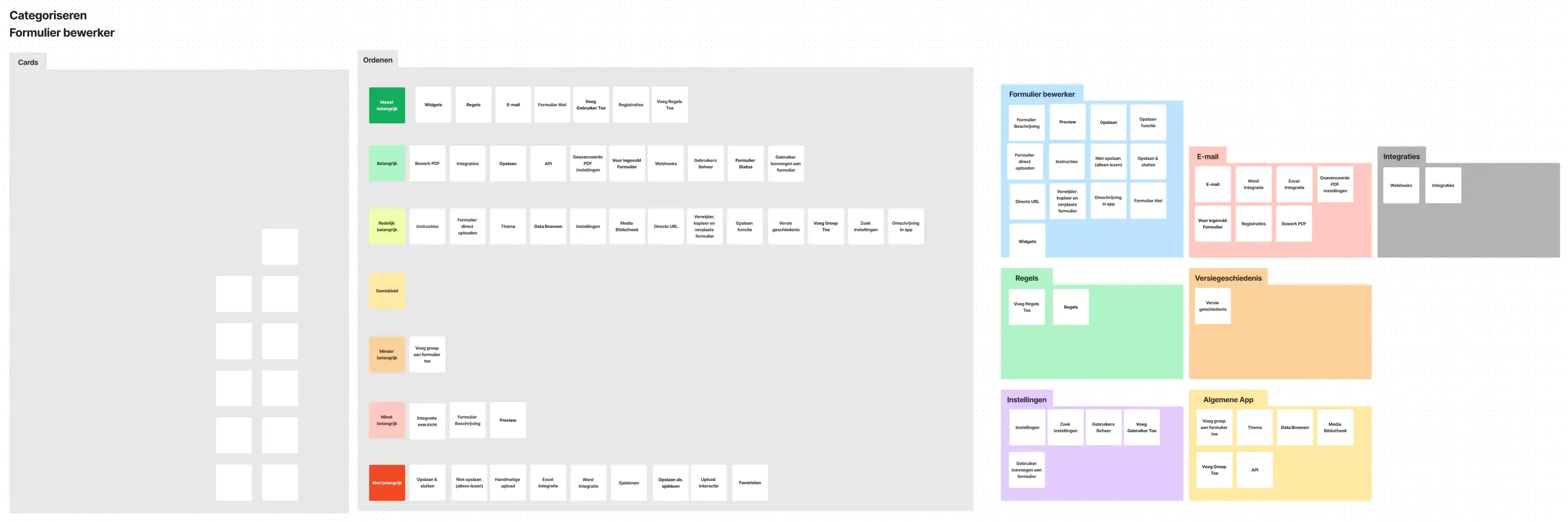
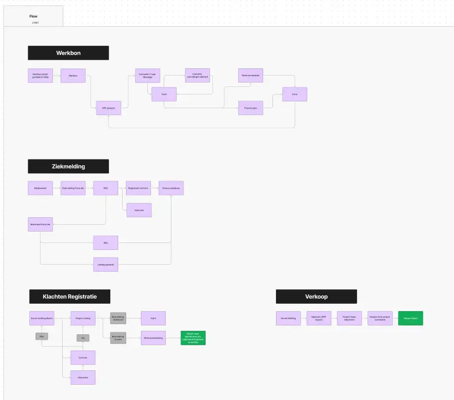
- Form Flow
Last, we’ve asked our users to lay out the workflow of a form. So for example if a form has been filled in, through which department of the company does it go through, and how many people will see it? This was to reinvestigate our assumption about form usage, and what the process is of a form in a company.
Wrapping up our research
After 3 months of interviews, workshops and internal meetings we’ve reached the end of the research phase. Our users felt notable that we’ve come to them, and asked them about their experience. Some users were hesitant to share some insights beforehand. We’ve made sure that we want to hear their feedback to the fullest.
The key takeaway from this research was:
Our users are quick
Most users want to quickly design a form, they don’t want or need any hassle with ironing out certain details. Most forms are set up once, and slightly improved overtime. They rather start with something fresh instead of iterating on their current form.
Understanding needs from dev and users are key
Reflecting on the process, we could’ve brought different stakeholders earlier into the fold of the process. I was very gate-keeping the first part of the process, because well, that’s just what UX-designers do. Right? Bringing in different departments earlier into the process means that they also gain more empathy for the end user of our product. This became apparent much later during a usability test with a user.
The design process is wacky
I thought the double-diamond method would be a perfect framework for this project. Designing the right thing, designing things right. I thought this in combination with our agile work method would be a beautiful marriage. However, after our research and starting ideating. I’ve quickly noticed this project has become a waterfall project, with a dedicated “hand-off” phase.
Focus on requirements and MVP first, features comes next
We started designing with users goals in mind. With the amount of work that comes with a CRUD operation on a high level, requirements for different parts of the product was a must. We discovered this after we were struck by feature and scope creep after a couple of months. Setting up and writing requirements meant hacking away at “fluff” in features and design.